Floatplane is a premium video hosting platform founded by Linus Tech Tips (LTT), offering high-quality video streaming, exclusive behind-the-scenes content, and community interaction outside of YouTube. As a long-time LTT viewer for over 10 years, I noticed that their subscription page had usability and visual hierarchy issues that could be improved. I took this as an opportunity to apply my UI/UX expertise and redesign it for a more intuitive and engaging experience.
Problem Statement
The existing Floatplane subscription page had several usability challenges:
Lack of clear differentiation between plan tiers
Overwhelming text blocks making it harder to skim key benefits
Weak visual hierarchy leading to difficulty in decision-making
Generic CTA buttons that did not reinforce user confidence
Inefficient use of whitespace resulting in a visually unbalanced layout
To improve the user experience and increase conversions, I redesigned the page with a modern, user-friendly approach.
Research & Analysis
I conducted a heuristic evaluation of the existing design and analyzed industry-leading subscription models (e.g., Patreon, YouTube Premium). Key takeaways:
Users should instantly understand plan differences
Important features should be visually emphasized
CTAs should be strong, clear, and action-driven
Design Goals
Enhance Visual Hierarchy – Make the premium plan stand out while maintaining balance.
Improve Readability – Organize information for quick scanning.
Streamline Decision-Making – Reduce cognitive load by presenting only necessary information upfront.
Design Process
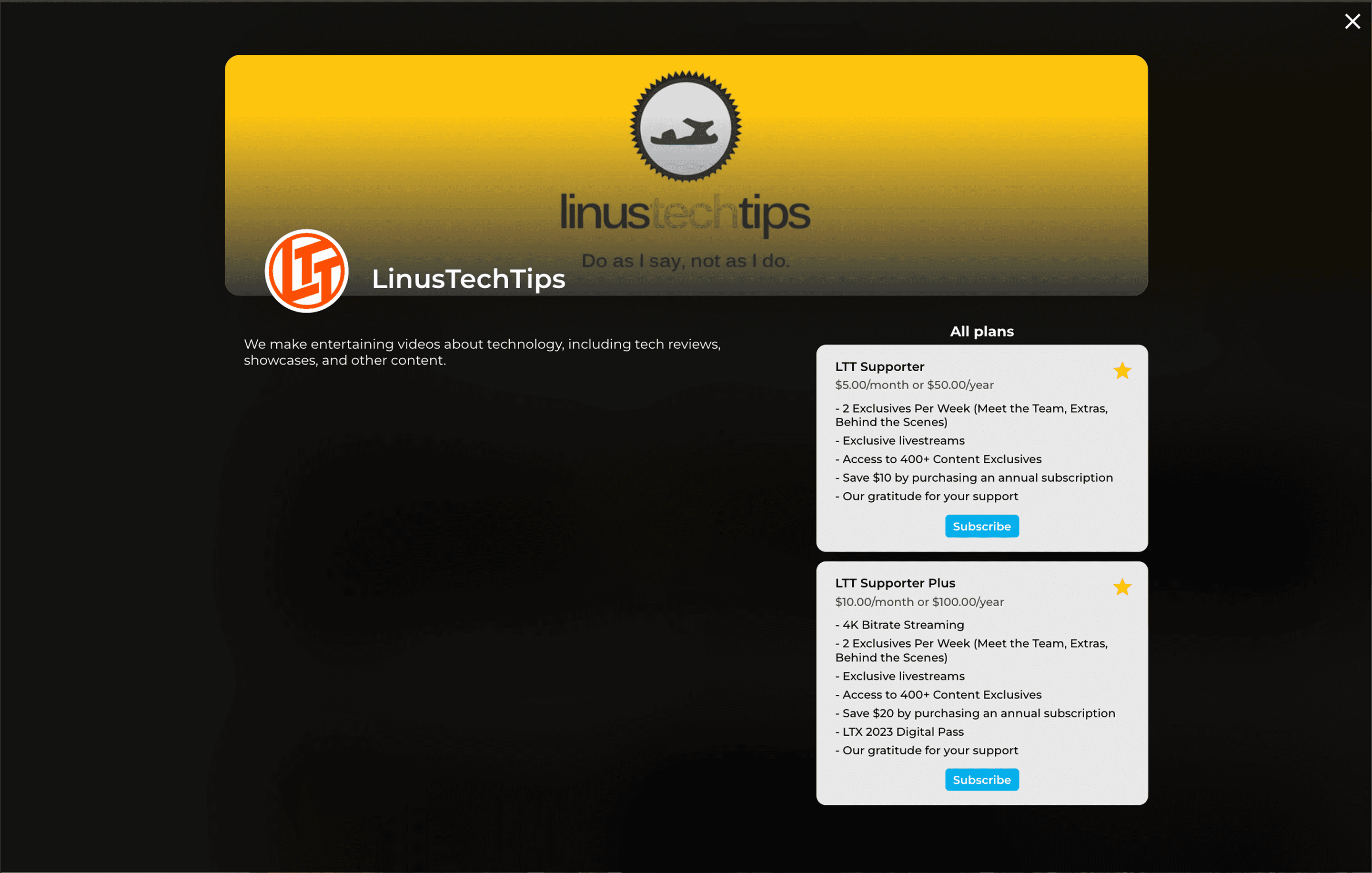
Current Floatplane Subscription Page UI
Pros
Clearly identifies the channel you are subscribing to
Includes channel banner, furthering visual identity
Provides all necessary information about subscription tiers
Cons
Lack of visual emphasis on key plan differences
The page feels outdated compared to industry-leading subscription services
Unclear what the 'stars' on the plan cards mean
Whitespace is unusual
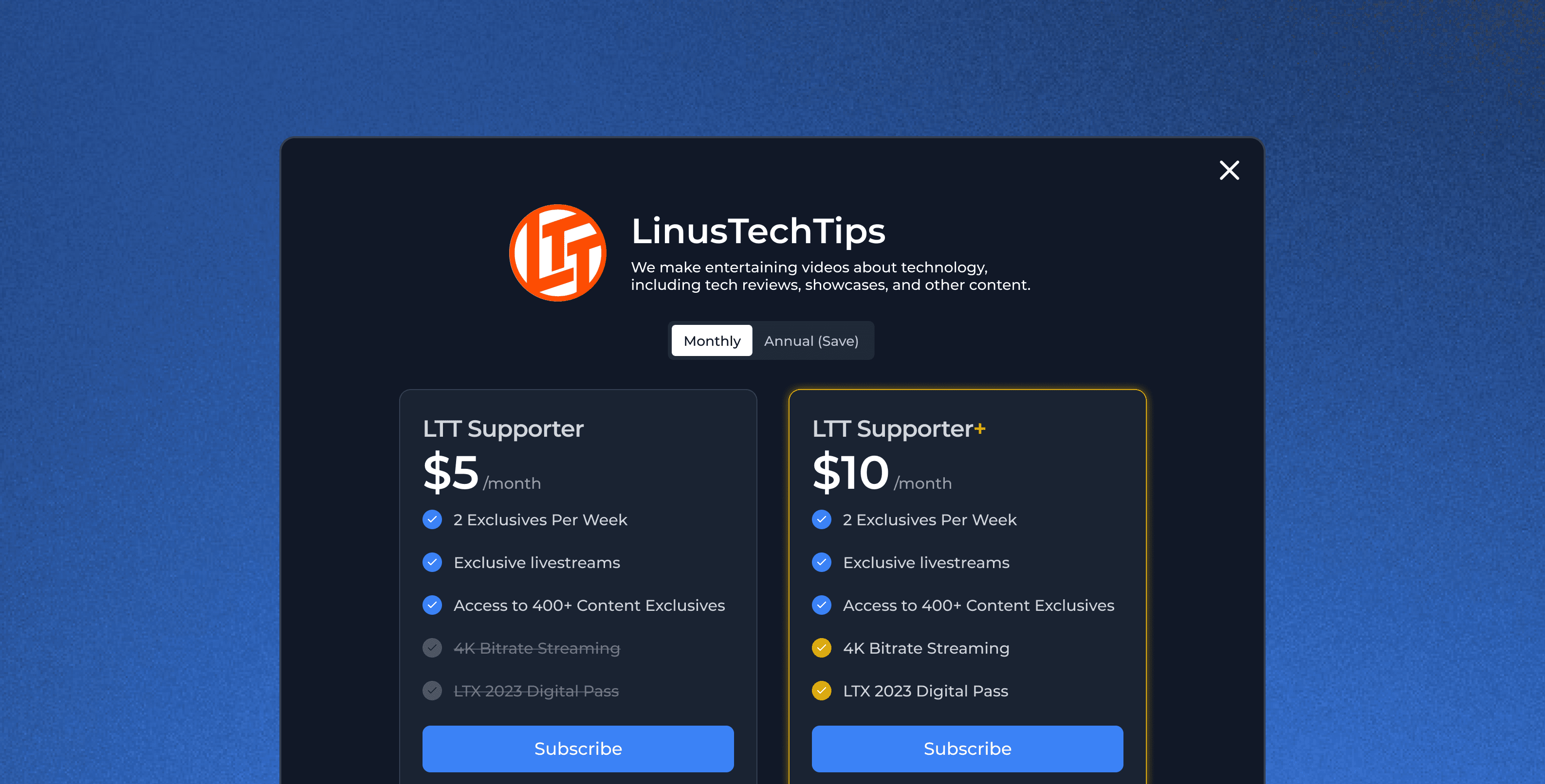
Initial Redesign
Here is a comparison between the first version of my redesign and the final version
Changes I made in between v1 and the final design:
Increased emphasis on price with increased font size
Added checkboxes and gold border to drive more attention to premium tier offerings
Moved channel title and description to center to improve layout
Impact & Reflection
Although this was a self-initiated project, the redesign aligns with best practices in conversion-optimized UI/UX. If implemented, it could potentially:
Increase conversion rates by improving clarity and usability
Reduce decision fatigue and enhance the subscription experience
Strengthen Floatplane’s brand perception as a polished, premium service
Takeaways
Small changes can drive significant impact – A well-structured layout can drastically improve user comprehension.
User empathy is key – Understanding the audience (tech enthusiasts) informed the visual and functional choices.
Passion fuels great design – As a longtime LTT fan, this project was not just a redesign but a personal endeavor to improve a platform I care about.