While spending a summer in the SF Bay Area, I quickly came to love Sizzling Lunch, a Japanese restaurant serving ‘hot plate’ style food. Dishes typically include rice with a bunch of toppings and raw meat of your choice. Your dish arrives on a hot cast iron plate, where you cook the meat and then combine it with your rice.
Customers order on iPads at every table. From the iPad, you can call the waiter, pay for your meal, and of course, order food and drinks.
Unfortunately, the Point of Sale app they were using left a lot to be desired, so I wanted to try redesigning it.
Design Process
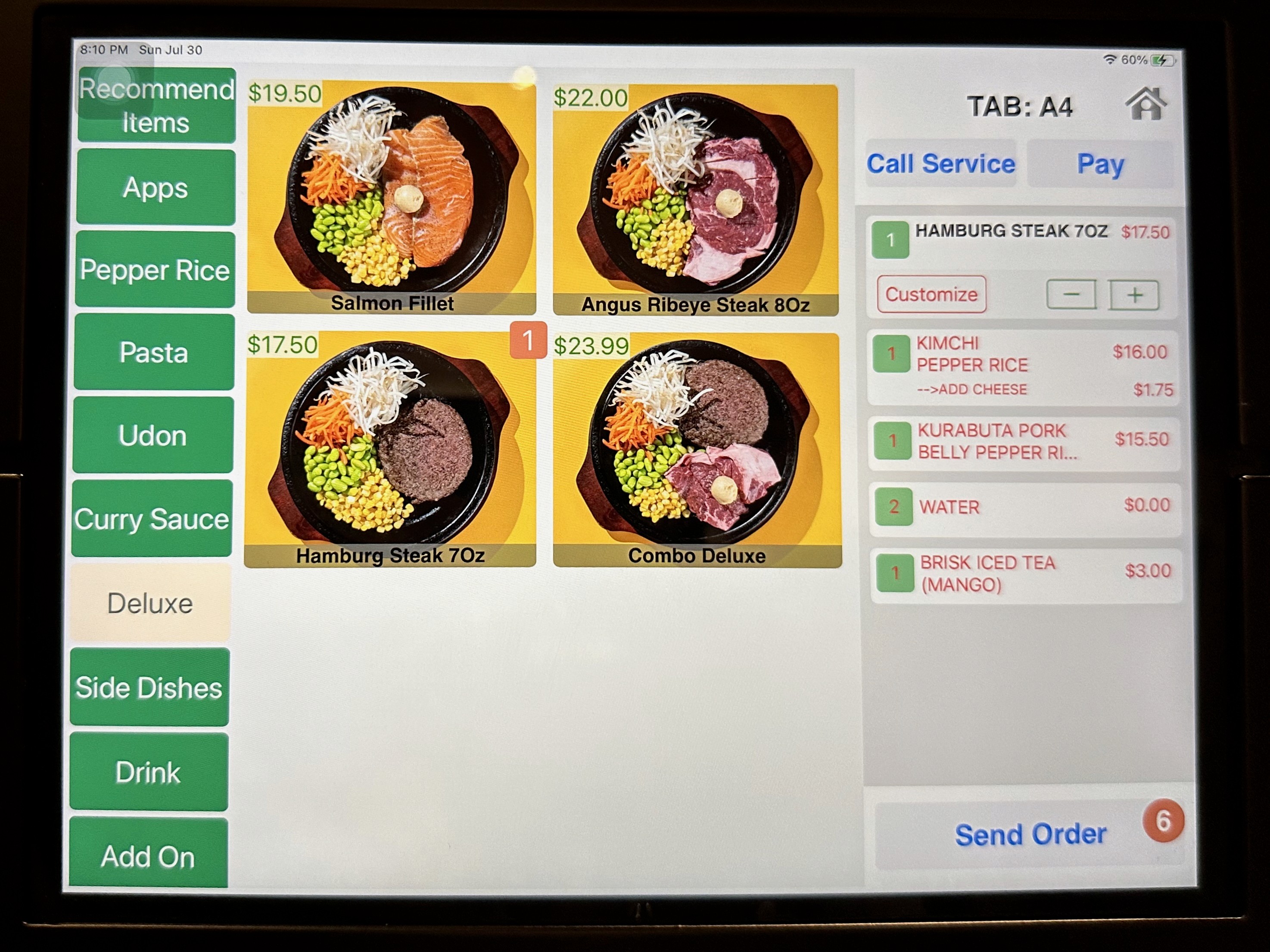
Current Sizzling Lunch App UI
Pros
All the menu categories and the cart are always visible on the page.
It's hard to get lost when using the app.
The food images are really big.
Cons
The app's design isn't very consistent
Almost all of the text in the cart is red.
Color choice seems random
I counted 6 different shades of gray on the home page
Cart items have unintuitive UI — impossible to know by looking that tapping brings up customization options
Redesign
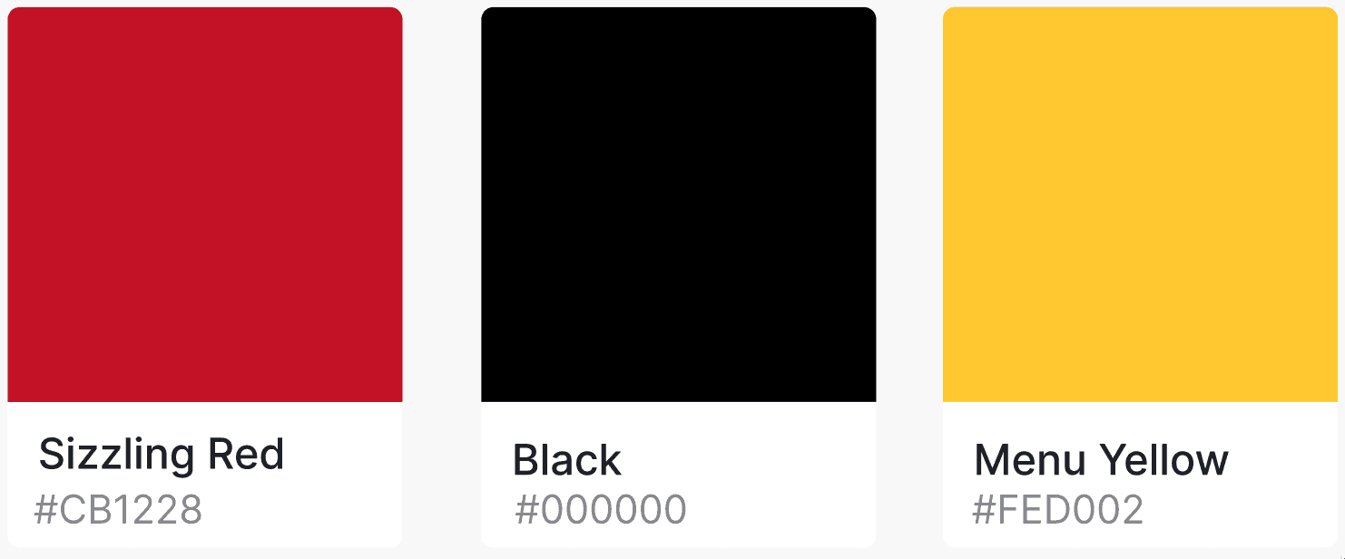
Colors: Apart from the red and black in their logos, their website doesn’t give away much in terms of branding direction, so I’m going to be basing my decisions on the design of their restaurant locations.

Google Maps review photo of a Sizzling Lunch branch
Here we see more red and black. The waiters wear black shirts and hats with their logo printed in red and white. The paper surrounding the plate has a flame graphic going around the edge. Additionally, the images of their dishes on the iPads all have yellow-gold backgrounds. From these sources, I put together the following color palette.
User Interface
I wanted to give more space to the area with the food options (Menu Area), so I rearranged the layout as shown below.

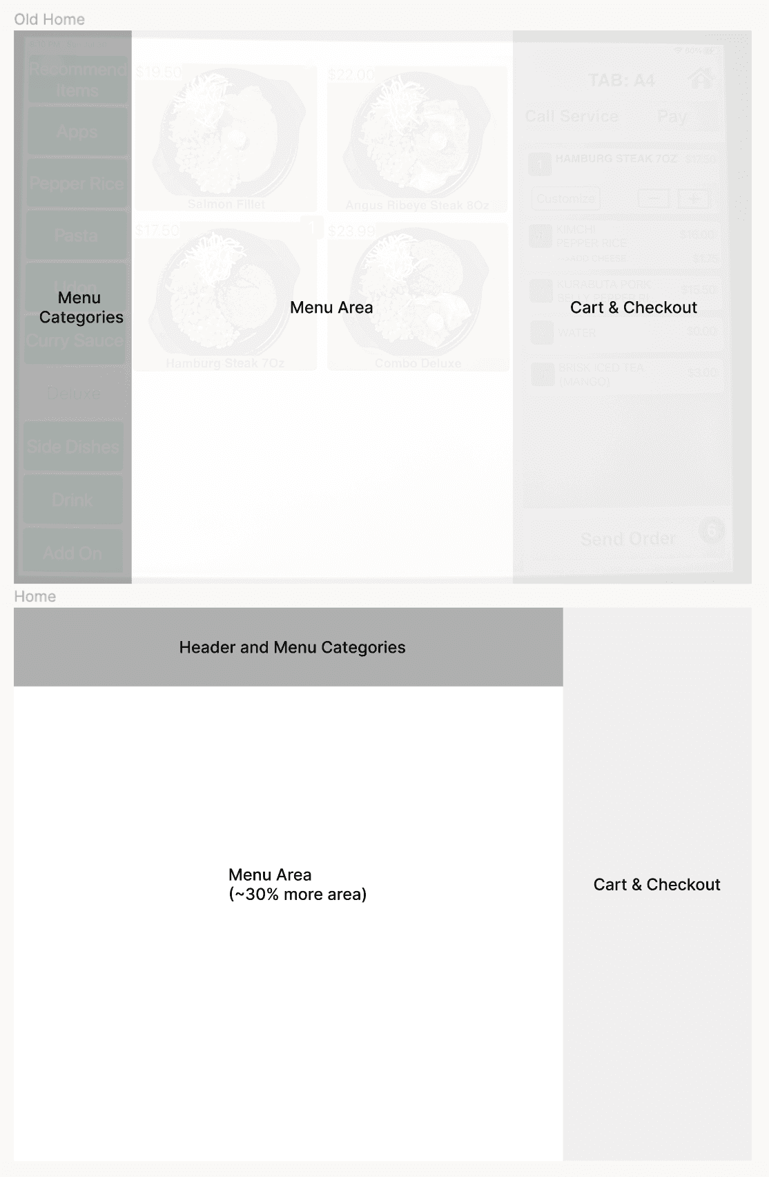
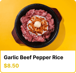
This layout gained roughly 30% more area to the menu area! I loved the way Sizzling Lunch has huge images for all their menu items. I wanted to keep that look, but tidy up the dish names and pricing, leading me to come up with this design.
Here is the first version of my redesign!
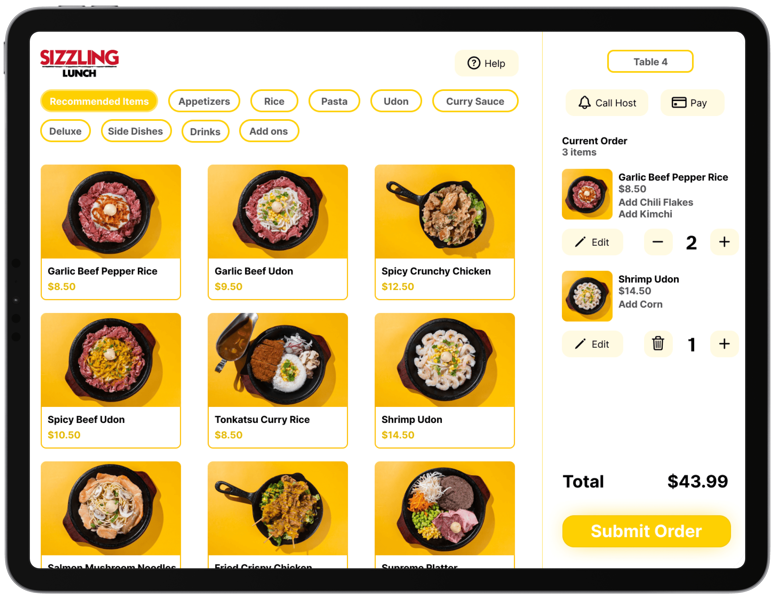
I think this interface is a big improvement when it comes to consistency, while keeping in the elements that made the original app great. I kept all the controls always on the screen so existing users would feel comfortable. I also kept the menu item images large to highlight the amazing food served by Sizzling Lunch.
Areas of Improvement
But there are still areas that I want to improve. First, the colors. There is an excessive use of the same yellow color, and I believe the page would look better if we introduce some variation.
Next, the buttons. I want them to have a more substantial feel. While I like the 'Submit Order' button, the buttons in the lighter yellow shade don't feel well-integrated into the interface. Additionally, the 'Total' text could also benefit from appearing more grounded in the interface.
I’d also like to create better separation between the checkout panel and the menu panel by adding a light gradient background.